feature
Interactive Crime Heatmaps
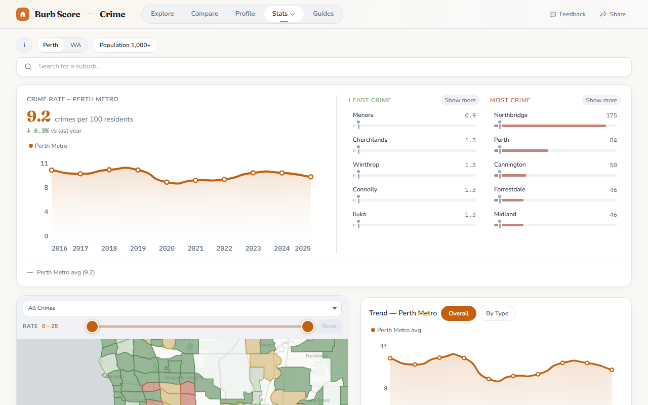
The Crime page now features an interactive heatmap that shows crime rates by suburb. Filter by offence type (violent, property, drug, etc.), year, and minimum population to focus on the suburbs that matter to you.
Each suburb is color-coded from green (safest) to red (highest crime rate per capita), and clicking any suburb shows the full breakdown.
Want to know when we ship something new?
Join the newsletter — no spam, just feature updates.