Flood zones, bushfire prone areas, aircraft noise & developments — five government hazard layers on one Perth map
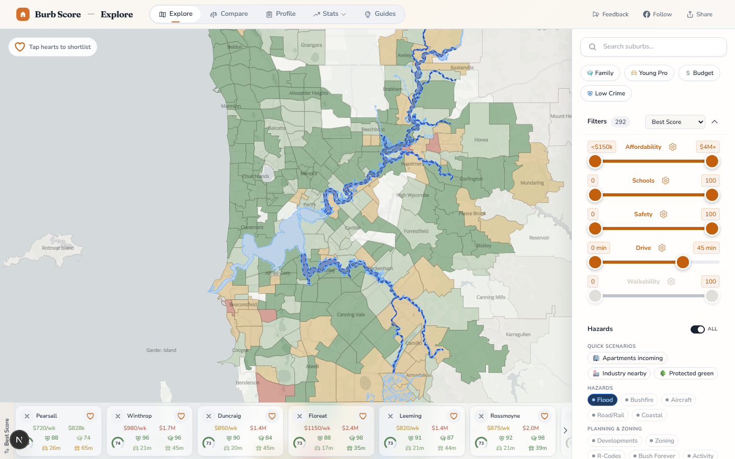
When people ask what makes a Perth suburb a safe long-term bet, the answer isn't just "low crime and good schools". It's "what can go wrong with the land itself". Today we ship the first five overlays that answer that question — flood, bushfire, aircraft noise, road/rail noise, and the residential development pipeline — on the Explore map and every suburb profile page.
Flood zones — sourced from DWER
The Department of Water and Environmental Regulation publishes Perth's official flood mapping in three tiers, and every tier is on the map now:
- Floodway (darkest blue) — the channel where floodwater actively moves during a 1-in-100 year event. No building is permitted here. Swan River, Canning River, and Helena River all have extensive floodways.
- Flood fringe (medium blue) — the area that will be inundated in a 1-in-100 year flood but where floodwaters are relatively shallow and slow. Building is permitted but with conditions (minimum floor levels, special foundation requirements).
- Floodplain (light blue) — the broader hydrologically-defined extent, including less frequent flood events.
Tap any flood polygon and the tooltip shows the zone severity, the river or creek it belongs to, and the name and year of the study that produced the mapping — so you know whether you're looking at 2022 Swan River modelling or 2004 Southern River modelling.
Bushfire prone areas — sourced from DFES
The Department of Fire and Emergency Services designates every Bushfire Prone Area in the state. Inside these zones, the WA building regulations impose additional planning and construction requirements — Bushfire Attack Level (BAL) assessments, minimum separation distances, ember-proof construction, hazardous vegetation management plans.
Tap a polygon and the tooltip names the LGA and the year the designation was gazetted, with a plain-English reminder that additional planning and building requirements apply. Outer-metro areas from Kalamunda east through the Darling Range, and northern suburbs fringing the native bush corridor, have extensive bushfire-prone coverage.
Aircraft noise (ANEF) — sourced from WAPC
The Australian Noise Exposure Forecast contour bands around Perth Airport and Jandakot Airport. ANEF values run from 20 (acceptable for most residential use) up to 40 (very high noise impact — not compatible with residential). The most heavily noise-affected suburbs in Perth are High Wycombe, Redcliffe, Belmont, Rivervale, Forrestfield and Thornlie.
The overlay uses graduated shading — lighter purple at ANEF 20, deeper purple at ANEF 40 — so severity is readable at a glance. Tap a polygon and you get the specific ANEF band, the source airport, and a plain-English interpretation: "ANEF 25 — moderate — conditional residential" vs "ANEF 35 — significant noise impact".
Road & rail noise corridors — SPP 5.4
The WA Planning Commission's State Planning Policy 5.4 — Road and Rail Noise defines noise buffer zones around significant transport corridors. The layer covers six corridor types — Freight Railway, Metropolitan Passenger Railway, Strategic Freight / Major Traffic Route, Other Significant Freight / Traffic Route, Proposed Freight, and Proposed Metropolitan Passenger Railway — each styled with a different intensity of orange.
Tap a corridor for the exact type, whether it's proposed or in use, and the regulatory status. SPP 5.4 compliance typically requires additional acoustic treatments for residential development within a corridor buffer, so being inside or adjacent to one is a material factor on resale.
The residential development pipeline — UDP
The final layer is forward-looking: the Department of Planning, Lands and Heritage's Urban Development Program (UDP) pipeline. Every approved and planned residential development in the Perth metro area, staged across three horizons — short term (0–5 years), medium term (6–10 years), and long term (10+ years) — with dwelling counts and commercial-floor counts.
Tap any green UDP polygon and the tooltip shows the estate name, the suburb and LGA, the developer reference, the dev type (residential / mixed use / industrial), and the pipeline broken into the three horizons — for example, "Ellenbrook Malvern Precinct — Residential — 4,200 dwellings (0-5yr), 3,800 (6-10yr)".
The 0–5 year figure is a reliable leading indicator of rental and sale supply; the 6–10 year figure is a leading indicator of long-term neighbourhood character change. We use both in the new 10 Perth suburbs with the most new housing ranking.
Integration with suburb profiles
Every suburb profile page now carries:
- A Hazard Map Card that mirrors the Explore map's overlays scoped to the suburb boundary.
- Summary rows showing the percentage of the suburb inside each hazard type, colour-graded.
- A full-screen Hazard Map Modal with the same address-search, presets, and sub-filter chips as the Explore map.
How the data actually works
Each overlay is a vector PMTiles file served from our CDN, rendered client-side by MapLibre GL — so overlays remain fast to toggle and tooltips are instantaneous even on older phones. Source data is refreshed quarterly from the WA government's SLIP (hazard layers) and the DPLH UDP snapshot (developments). See the full methodology for the fetch-and-tile pipeline and the exact source study citations.
This release is the foundation for everything that followed: the April 15 master toggle + address search + presets shipment, and the April 17 seven new planning layers shipment that brings the total to 12.
Want to know when we ship something new?
Join the newsletter — no spam, just feature updates.